
CASE STUDY
Itaú & EBAC
exploring the power of UX/UI Design!

The project was developed in partnership with Itaú Bank, and British School of Creative Arts and Technology - EBAC, for the development and practice of skills during the study of the UX/UI Designer profession.
This study contemplates a complete creation of UX Research, UX Design and UI Designer processes focused on offering the best user experience, bringing new features needed by the bank on different devices.
Overview
BACKGROUND
As part of a collaboration between EBAC (Escola Britânica de Artes Criativas e Tecnologia) and Itaú, the project aimed to explore improvements in the user experience of digital banking interfaces. The challenge was to propose solutions that addressed real pain points faced by users in everyday banking: information overload, unintuitive flows, and a lack of personalization.
How could we reimagine digital banking to be clearer, faster, and more human-centered?
MY ROLE
MY ROLE
As a UX/UI Designer, I was responsible for conducting user research, mapping pain points, and designing high-fidelity prototypes focused on improving navigation, accessibility, and clarity in financial transactions. I developed user flows, wireframes, and final UI components aligned with Itaú’s visual identity.
I worked as part of a multidisciplinary team of designers and mentors from EBAC, following an agile, iterative process. We applied design thinking methodologies, usability principles, and real-world constraints to deliver solutions aligned with the expectations of both users and a large-scale financial institution like Itaú.

Web

App

UX Research
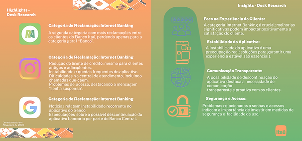
To better understand real user frustrations, I conducted a one-month analysis of user comments on Itaú’s official Instagram posts. By applying qualitative content analysis techniques, I was able to identify recurring pain points directly from the public voice of customers. The most frequent themes included: App crashes and instability during login, confusing error messages with no guidance, frustration with chatbot support, felays or difficulties in making transfers.
I started with an in-depth analysis of Itaú from the customer's perspective, identifying real-world frustrations and unmet needs through public feedback and digital behavior. This allowed us to generate hypotheses and uncover opportunities for improving digital banking experiences across multiple devices.
The project followed a human-centered design cycle, combining research, ideation, validation, and technical feasibility. The steps included: Desk Research, User Research (via Instagram feedback analysis), Empathy Mapping, User Journey Mapping, Needs Statements, Accessibility and Inclusive Design, Usability Testing, Feasibility & Implementation Assessment.

Customer Satisfaction Insights - Instagram
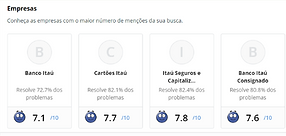
Consumer Advocacy Platform

News About Itaú
I used metrics and KPI models to inform design decisions and gain insight into user behavior on the website and app. I identified pain points, synthesized the findings, highlighting relevant insights.
User Insights
_edited.png)
Key Takeaways
-
Technical & Functional Improvements: Users demand better app stability, fewer technical issues, and efficient online services.
-
Financial Transparency & Support: Clear solutions for billing, debts, and quick, effective responses to concerns.
-
Customer Service & UX: Emphasis on fast, hassle-free processes (e.g., account closure, fund access) and consistent, satisfactory service.
-
Recognition of Strengths: Users highlight the importance of maintaining and expanding existing positive aspects of Itaú’s services.
Based on the findings, I organized the major issues, turning them into potential opportunities to be explored and grouping the topics by similarity so that the requirements could be analyzed later in the project. This clustering of user needs helps prioritize actionable improvements for Itaú’s products and customer experience.
User Profiles
Based on the gathered insights from UX Reasearch, I created personas defining the needs, behaviors, and goals. These personas represent fictional user profiles. The information for creating the personas was collected from user-centred research, where I identified the users’ challenges and pain points. The knowledge of the target audience greatly assisted in developing tasks to be fulfilled on the website and app, enabling a preliminary study based on the current information architecture.


User Jouney


The goal of mapping a User Journey for each persona was to deeply understand their unique interactions with the product, from initial engagement to task completion and identify pain points, emotional triggers, and opportunities for optimization. By aligning the system with their specific goals This approach eliminated guesswork, prioritized user-centric solutions, and ultimately created a seamless, empathetic experience tailored to each persona’s needs.
I was able to determine the user's intend, what tasks are required to achieve that intente and what actions the user should take to complete the task and what path they sould follow.
Style Guide

To ensure a seamless transition while introducing updates, the new Style Guide and Design System was crafted with intentional alignment to the original design language.
Key elements, such as color palettes, typography hierarchies, and component behaviors, were preserved to maintain brand familiarity and user trust. However, subtle refinements were introduced to enhance usability, accessibility, and scalability.
Core Principles:
-
Visual Consistency: Retained foundational styles (e.g., primary colors, button shapes) to avoid disrupting user muscle memory.
-
Enhanced Modularity: Expanded the component library with reusable, adaptable variants (e.g., responsive cards, dynamic forms) while adhering to original spacing and interaction patterns.
-
Accessibility Upgrades: Improved contrast ratios and focus states to meet WCAG standards without altering the aesthetic essence.
-
Documentation Clarity: Added detailed usage guidelines to bridge the old and new systems.
Outcome: A backward-compatible system that feels familiar to users and teams, yet is future-proof for iterative innovation. Changes were deliberate, data-informed, and always rooted in the original’s DNA
User Interface
The collected data indicates a strong focus on operational, technical, and customer service needs within Itaú Bank's ecosystem. To address these needs while prioritizing security, the following solutions aim to reduce operational/account-related issues and enhance service reliability. These span five channels, from common platforms (web, mobile) to emerging ones (IoT devices) and focus on:
-
Usability
-
Interactivity
-
Security
-
Transparency
Mobile Version Overview - Prototype
Implementation Approach:
New tools will integrate seamlessly into the existing infrastructure without disrupting the core layout, ensuring a cohesive user experience.
Tablet Version Overview - Prototype


ATM Solutions - Security Feature


Proposed Enhancements:
-
Enable facial recognition for secure authentication.
-
Disable ATM access to reduce fraud vectors.
-
Block transactions exceeding a predefined amount across all payment methods.
-
Enable transaction notifications on smartwatches for real-time monitoring.
-
Require biometric authentication for smartwatch transactions.
-
Restrict access via smartwatches if compromised or high-risk.
The objective was strengthen security protocols while maintaining user convenience, focusing on multi-layered authentication (biometrics, device-level controls), proactive risk mitigation (transaction limits, access restrictions) and real-time user awareness (notifications).
Web and Smartwatch Overview


Fully responsive design for seamless cross-device access (desktop, tablet, mobile) aand a new integrated tools to elevate functionality without and improving the usability to modernize the digital banking experience by prioritizing adaptive interfaces that maintain clarity on any screen size and value-added features aligned with user needs, implemented cohesively within the existing framework.
Conclusion
Through a user-centered approach, innovative ideas were explored, and tools with visual and functional solutions were implemented, prioritizing the safety of those who choose Itaú.
This study provides a detailed overview of each stage of the process, from the initial analysis to the final delivery of a responsive, simple, and efficient digital ecosystem.
As a result, it is possible to enhance the customer experience at Banco Itaú, offering a more intuitive and satisfying journey across all digital touchpoints.