
_________________________________________________
ArcGIS: Dashboards for prevention and monitoring
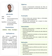
As a Product Designer in geospatial systems, I’ve had the opportunity to collaborate on impactful environmental projects using ArcGIS and other geographic tools. Working closely with multidisciplinary teams, I designed interfaces that not only visualize complex data but also empower users to make smarter decisions, whether managing environmental risks for wildlife rescue monitoring systems.


Project 1:
Wildlife Rescue Monitoring Dashboard

WEB
BACKGROUND
This project involved the visual refinement of a wildlife rescue monitoring dashboard developed in ArcGIS by CARUSO Soluções Ambientais & Tecnológicas and GISCARUSO Geotecnologia & Inovação.
As a Product Designer, I worked closely with the engineering team to identify opportunities for improving the dashboard’s clarity and accessibility, without changing its core structure. My contributions focused on small but intentional UI adjustments to improve readability and visual organization.

DESIGN APPROACH AND COLLABORATION

I introduced a color palette inspired by Brazilian fauna, bringing more meaning and distinction to the data without overwhelming the interface. Design decisions were made collaboratively with engineers , ensuring that changes respected system limitations while enhancing usability.
Together, we aligned on small, focused updates that simplified the experience, improved hierarchy, and made the dashboard more welcoming for end users.
ACHIEVEMENTS
Although the redesign didn’t involve a full structural overhaul, the results were tangible:
✓ Improved data interpretation and visual consistency
✓ A more intuitive and informative interface.
✓ Greater engagement from internal teams.
✓ This project reinforced the value of thoughtful design, even within highly technical environments. Sometimes, small decisions truly make a big impact.

_________________________________________________
ArcGIS: Dashboards for prevention and monitoring
As a Product Designer in geospatial systems, I’ve had the opportunity to collaborate on impactful environmental projects using ArcGIS and other geographic tools. Working closely with multidisciplinary teams, I designed interfaces that not only visualize complex data but also empower users to make smarter decisions, whether managing environmental risks for the energy sector monitoring systems.


Project 2:
Wildlife Rescue Monitoring Dashboard
WEB
BACKGROUND
This project was developed under the ANEEL R&D Program for CPFL Energia, one of Brazil’s largest electric utility companies. I worked as a UX/UI Designer and UX Researcher for GIScaruso, part of the Caruso Group, specializing in geospatial and environmental solutions.
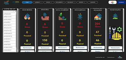
The goal was to improve the DE3075 Risk Management System, a dashboard that monitors environmental risks across power transmission line areas in Brazil. The system includes multiple modules for detecting and predicting hazards such as:
Wildfires


Erosion
Landslides

Lightning Strikes

Anthropic Invasion

Vegetation

MY ROLE
As the UX/UI Designer and UX Researcher on the DE3075 project, I was responsible for enhancing the overall user experience of the risk management system through a user-centered design approach.
My contributions included:
UX Research: Conducted interviews and gathered feedback from end users to understand their workflows, pain points, and expectations.
UI Redesign: Restructured the interface to improve navigation, readability, and overall usability — using Figma for design and prototyping
Usability Testing: Planned and executed usability tests to validate design improvements and guide iterative updates.
Documentation & Tutorials: Created in-app tutorials, help pages, and instructional videos to support user autonomy and reduce support demands
Collaboration: Worked closely with geospatial engineers and did some prompting front-end HTML/CSS embeded adapts to the design within the constraints of Esri’s Experience Builder and custom environments.
Design Handoff: Delivered detailed design specifications and supported implementation to ensure visual and functional consistency.
Throughout the project, I served as a bridge between users, developers, and stakeholders , ensuring that design decisions were aligned with both user needs and technical realities.

Web
UX Discovery
The redesigned system improved usability and empowered teams to manage infrastructure risks more effectively.
Impact Highlights:
-
35% reduction in navigation difficulties reported by users
-
100% of tested users completed tasks without external support
-
Improved interpretation of graphs and spatial data
-
Excellent feedback received on the clarity and usefulness of the in-app documentation and tutorials
-
User satisfaction score increased from 3.82 → 4.00 out of 5.00
This project demonstrated how thoughtful UX can transform complex, technical tools into intuitive and functional systems, even within platforms that offer limited UI flexibility.


UX Research
The redesigned system improved usability and empowered teams to manage infrastructure risks more effectively.
Impact Highlights:
-
35% reduction in navigation difficulties reported by users
-
100% of tested users completed tasks without external support
-
Improved interpretation of graphs and spatial data
-
Excellent feedback received on the clarity and usefulness of the in-app documentation and tutorials
-
User satisfaction score increased from 3.82 → 4.00 out of 5.00
This project demonstrated how thoughtful UX can transform complex, technical tools into intuitive and functional systems, even within platforms that offer limited UI flexibility.

Process and Design Contributions
I conducted UX research through user interviews to uncover pain points and clarify expectations. Based on those insights, I redesigned the interface in Figma, improving the layout, navigation, and clarity of complex data visualizations.
Using Esri’s Experience Builder and custom HTML/CSS adaptations, I collaborated with developers to deliver a more intuitive and functional interface within the platform’s technical constraints.
To support onboarding and reduce support dependency, I also created:
Key Contributions:
✓ Conducted user interviews to uncover pain points and define priorities;
✓ Redesigned the interface using Figma, with focus on clarity, hierarchy, and usability;
✓ Adapted and implemented improvements using Esri Experience Builder, Map Viewer, and custom HTML/CSS;
✓ Performed usability testing to validate improvements and iterate based on user feedback.
✓ Created interactive tutorials and documentation embedded within the platform;
✓ Produced video walkthroughs to onboard and guide users.
Usability Tests
To ensure the platform's effectiveness, two rounds of usability testing were conducted with CPFL users from various departments.
First Round of Testing
In the initial phase, users evaluated the system in its earlier state. While participants generally considered the interface easy to use (77% rated it as "easy" or "very easy"), several critical issues were identified:
-
35% of users encountered difficulties navigating the interface.
-
82% said they would require documentation or support materials to use the system effectively.
-
The average satisfaction rating was 3.82/5.0, with common suggestions focusing on clearer terminology, improved graph interpretation, and better data presentation.
-
Specific modules, such as Wildfires and Landslides, raised questions about map interpretation and information clarity.


Second Round of Testing
After implementing UI and UX improvements, including clearer labels, reorganized information, and the integration of tutorials, the system was tested again.
-
The number of users who needed support materials dropped significantly to 0%, thanks to the creation of an interactive tutorial and documentation.
-
The average satisfaction rating rose to 4.00/5.0, despite the system's technical limitations.
-
Users reported greater ease in finding information and interpreting risk indicators.
-
Suggestions from the first test were addressed, and users expressed appreciation for the improvements made.
These tests were fundamental in guiding the design iterations. By actively listening to users and refining the system based on their input, the platform became significantly more user-friendly, intuitive, and aligned with the workflows of professionals monitoring environmental risks in power transmission areas.
Tutorial and User Support
To support users in navigating and using the DE3075 platform independently, I structured a dedicated tutorial section with clear categories such as documents, management tools, risk modules, and geospatial resources. This area includes written guides, interactive videos, and step-by-step instructions for tasks like generating reports, managing workers, and working with LiDAR and vegetation polygons. The tutorial content was highly praised by users and stakeholders for its clarity and completeness, significantly reducing the demand for technical support.


Results and Impact
The redesigned system improved usability and empowered teams to manage infrastructure risks more effectively.
Impact Highlights:
-
35% reduction in navigation difficulties reported by users;
-
100% of tested users completed tasks without external support;
-
Improved interpretation of graphs and spatial data;
-
Excellent feedback received on the clarity and usefulness of the in-app documentation and tutorials;
-
User satisfaction score increased from 3.82 → 4.00 out of 5.00.
This project demonstrated how thoughtful UX can transform complex, technical tools into intuitive and functional systems, even within platforms that offer limited UI flexibility.
BEFORE

AFTER

